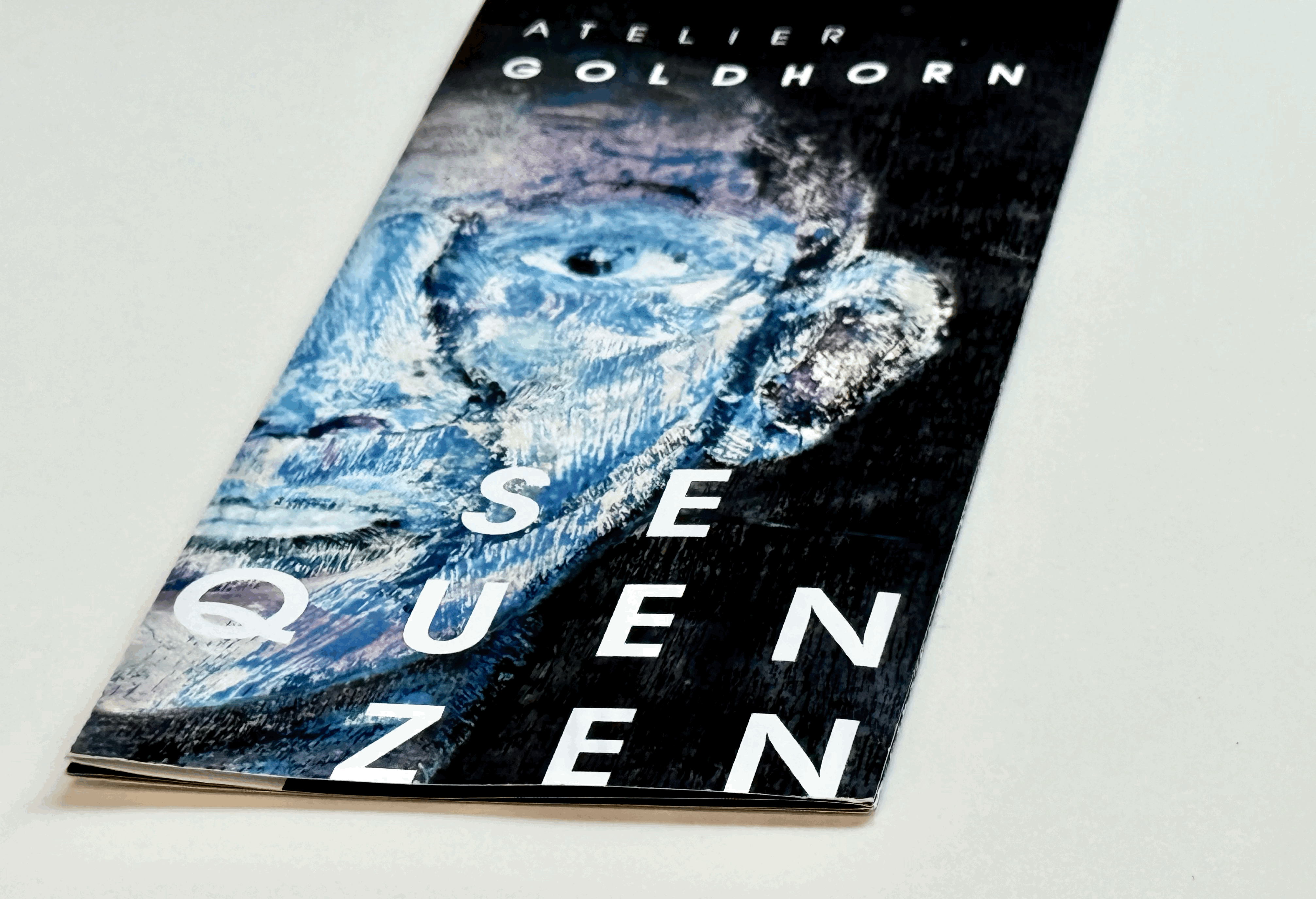
40 years into Art – Sequences of Helga Goldhorn
Client
Goldhorn
year
2025
Brand Design & Shooting
Project scope
About the project
Two months to show forty years. Helga Goldhorn—painter and former chainsaw sculptor—needed a clear identity and an exhibition that respected every phase of her work. We built a simple brand, a clean editorial system, and a photo story that moves from studio dust to gallery light. We observed her in her Munich studio, capturing everyday moments. The show and the catalogue align portraits and wood pieces in easy-to-follow sequences you can see, hold, and remember.
Challenge
How do we show forty years of work in four exhibition rooms without losing the artist’s identity or the details of her development? Helga’s art ranges from quiet portraits to bold wood pieces. We designed an identity that gives her work the stage. The goal was balance and energy—the art speaks loudest. The identity was built in about two months with a practical grid for daily applications and a simple yet striking typographic exhibition design.
Result
A clear, restrained design. A simple logo that steps into the background and colors that set the perfect stage for her progressive art. A photo series shows her everyday studio life; a catalogue becomes a memorable giveaway for art lovers. In a separate exhibition, works are arranged in sequences so the story unfolds. We scanned the artist market and developed a focused brand identity, photo documentation, art catalogue, and exhibition design.
Project duration: 2 months
Deliverables:
market outlook; mood board; logo design; stationery; photo documentation;
catalogue & exhibition design
Photo credits: Stefanos Notopoulos, München


